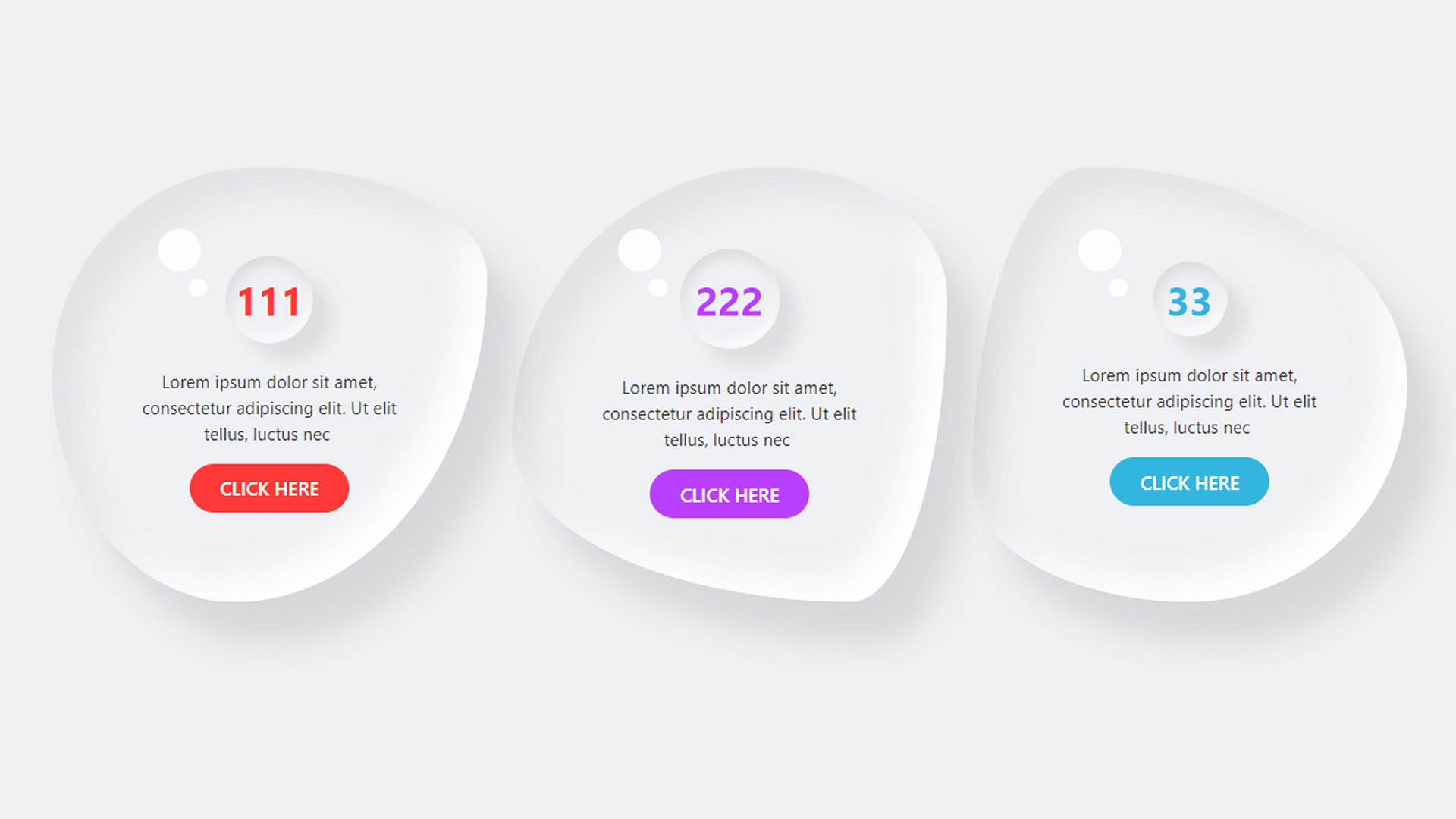
CSS NEEDED
:root {
--width: 50%;
--height: 60%;
--bottom: 30px;
--origin: 6%;
--opacity: 0.5;
}
selector{
position: relative;
z-index: 9;
}
selector::before{
content: '';
height: var(--height);
position: absolute !important;
bottom: var(--bottom);
right: var(--origin);
width: var(--width);
background: #000;
-webkit-transform-origin: left;
transform-origin: left;
-webkit-transform: skewY(7.5deg);
transform: skewY(7.5deg);
-webkit-filter: blur(15px);
filter: blur(15px);
opacity: var(--opacity);
z-index: -9 !important;
}
selector::after{
content: '';
height: var(--height);
position: absolute !important;
bottom: var(--bottom);
left: var(--origin);
width: var(--width);
background: #000;
-webkit-transform-origin: right;
transform-origin: right;
-webkit-transform: skewY(-7.5deg);
transform: skewY(-7.5deg);
-webkit-filter: blur(15px);
filter: blur(15px);
opacity: var(--opacity);
z-index: -9 !important;
}